Hello!
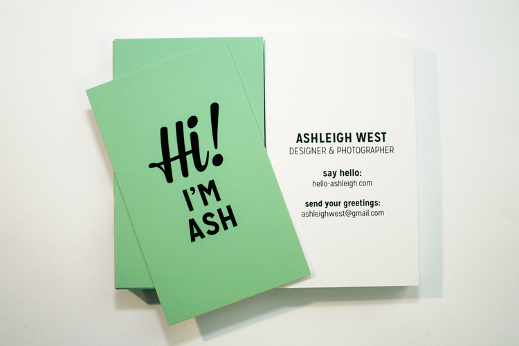
Its been a while. Today I thought I would boast a bit about Ash West. We both have been trying to get our feet shoved firmly in the hypothetical designer door. On more than ten occasions Ive decided to give up design and jump into clown college or marry rich. But that is a whole other commitment issue Im happy to avoid.
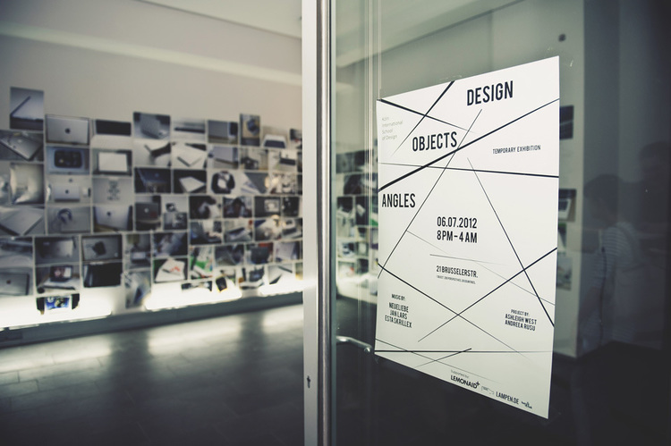
Anyway. She is focused on embracing "user experience design, visual communication, design strategy and content strategy. This is with a focus on creating human-centred design solutions." With a fair bit of travelling under her belt, and a conceptual brain to boot, her works are always layered with insight and expressions of her own design style.
Head over to her site: hello-ashleigh and have a squiz at her portfolio.
Showing posts with label User Interface. Show all posts
Wednesday, 30 April 2014
Bit of Boasting
Labels:
Ashleigh West,
Concept,
Design,
Graphics,
Info-design,
Photography,
User Interface
Friday, 7 June 2013
Update!
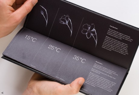
Along with the paintings, I'm making a pamphlet & business card. And possibly website (for the future considerations category in the marking guide...I think there is one). These are some spreads and cover ideas for the pamphlet. The cover will have black disappearing paint on the cover with orange stitching up the spine. Once people touch the pamphlet it will disappear showing a print under it. As of this moment, it will be the orange finger prints to reflect ergonomics and how people actually hold it.
These pics show how I hold the pamphlet and position the prints.
After questioning many many people about it, the handprint option is a winner.
Labels:
Concept,
Design,
Graphics,
Illustrator,
InDesign,
Info-design,
Photography,
Photoshop,
User Interface
Friday, 24 May 2013
Countdown!
Last month until 30min presentations are due.
I just bought the pigments to make thermo-paint. Itll take about 3weeks. From the states. To Sydney. Crap. After some research, relying mostly on the accounts from these two lovely sites: softcircuit2 & artisticjunkie, I've purchased the "dust" from solarcolordust and need to go buy a Liquitex Slow-Dri Fluid Retarder Additive from my local-has-everything-ever-imagined-artshop North Shore Art. For the presentation i'll also need to get a heating pad to put behind the displays in-order for the designs to change.
Inspiration:
Face 37 - September Poster
"September is typically regarded as a month of transition in the Northern Hemisphere as the dying embers of Summer are replaced by the cooler and greyer chills of Autumn and the onset of early darkness. It is often associated with melancholic self-reflection as if heat and sunlight are a temporary physical and mental panacea. inspired by the physical reality of changing seasons and simple emblematic change of colour of falling leaves, I used thermochromic ink that alters colour dependent on room temperature."
I just bought the pigments to make thermo-paint. Itll take about 3weeks. From the states. To Sydney. Crap. After some research, relying mostly on the accounts from these two lovely sites: softcircuit2 & artisticjunkie, I've purchased the "dust" from solarcolordust and need to go buy a Liquitex Slow-Dri Fluid Retarder Additive from my local-has-everything-ever-imagined-artshop North Shore Art. For the presentation i'll also need to get a heating pad to put behind the displays in-order for the designs to change.
Inspiration:
Face 37 - September Poster
"September is typically regarded as a month of transition in the Northern Hemisphere as the dying embers of Summer are replaced by the cooler and greyer chills of Autumn and the onset of early darkness. It is often associated with melancholic self-reflection as if heat and sunlight are a temporary physical and mental panacea. inspired by the physical reality of changing seasons and simple emblematic change of colour of falling leaves, I used thermochromic ink that alters colour dependent on room temperature."
You can purchase it here: face37
Another Example: Im not sure of the name, or who created the design but it can be found here: miafranceskennedy.
This is just damn great. Again, no idea who created it. Has nothing to do with thermoes but its could be applied.
Labels:
Design,
Film,
Graphics,
Info-design,
Ink,
Materials,
Technology,
Textiles,
User Interface
Sunday, 12 May 2013
Hydrochromic Things
Amy Winters, a British/Swiss artist made her first ready-to-wear printed collection where garments are able to change colour to sun and water.
Another wearable by SquidLondon.
Entire rooms dedicated to water.
Labels:
Design,
Ink,
Technology,
Textiles,
User Interface,
Walls
Saturday, 11 May 2013
Open Brain Storming
After researching photochromic and thermochromatic paints and their uses I've been thinking about the final presentation...Not long now. And I want to present something other than printed materials. I came across these handmade wall decals on facebook a while back. Just a bit of corn starch or a pre-made stick and boom instant wall art or wallpaper.
pistachioproject, sewingforscarlett & curbly have some good tutorials.
While I wouldnt be allowed to paint a wall at cofa, perhaps I could stick it on and peel it off.
Crazy walls crazy walls crazy walls
Photochromatic Stuff
The museum goudA redesigned their torture chamber using UV. Illustration - Jos Verwer, and Type - Trapped in Suburbia
pistachioproject, sewingforscarlett & curbly have some good tutorials.
While I wouldnt be allowed to paint a wall at cofa, perhaps I could stick it on and peel it off.
Crazy walls crazy walls crazy walls
The museum goudA redesigned their torture chamber using UV. Illustration - Jos Verwer, and Type - Trapped in Suburbia
Internal Philips Design Metamorphosis document. The bookcover uses photochromic and thermochromic ink.
Calignosity by Andreas Pohancenik - UV Varnish and invisible UV ink screen print on ebony plike, A1
Labels:
Concept,
Design,
Illustrator,
InDesign,
Info-design,
Ink,
Product,
Technology,
Textiles,
User Interface,
Walls
More Examples
Thermochromatic Projects!!!
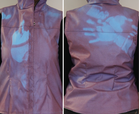
Hug Prints, by Catherine Sarah Young, is a project about Hugging. She sought to investigate "our perception of touch". Her site: theperceptionalist
These were her results:
Jay Watson's "Just a Little Longer" (jaywatsondesign) is an oak table finished with thermochromatics. Simple and effective. And out of my price range.
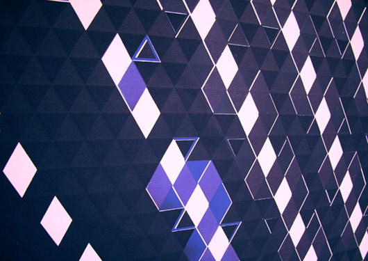
Francine LeClercq has an exhibition using painted cells that react the environment and audience.
Another project of hers, "No Picture Available [081122]"
Hug Prints, by Catherine Sarah Young, is a project about Hugging. She sought to investigate "our perception of touch". Her site: theperceptionalist
These were her results:
At the end of the session, I had two conclusions:
1. A responsive garment made people pay attention to the act of hugging in the sense that they had the feedback of the vest to observe after the hug. In normal circumstances, people would just hug and then carry on. Here I felt that they were aware of the vest’s thermochromism, and thus affected the pressure and duration of the hug.
2. Having a garment that responds to touch can make the person want to hug the wearer more. But it can also turn people away; I had an incident where the person refused to hug (I was a sad puppy), even though we’ve hugged on other, more informal, occasions. I suspect that if I kept doing this, I would encounter people who would not like the idea of calling out this particular interaction.
There are two directions in which I can take this project:
1. Investigate how this vest can affect specific relationships, such as parent and child, or husband and wife, etc.
2. Investigate how this can play out with strangers in public spaces.
In any case, I have a lot of hugging to do.
Jay Watson's "Just a Little Longer" (jaywatsondesign) is an oak table finished with thermochromatics. Simple and effective. And out of my price range.
Francine LeClercq has an exhibition using painted cells that react the environment and audience.
Another project of hers, "No Picture Available [081122]"
Photochromic & Thermochromatics
So the last couple ideas were not working out. They were catering towards the tutors' specialties and not necessarily as a combination of my majors: Graphics Media and Environmental/Spatial Design. I wasn't however processing the feedback correctly, even if Richard's was "make it".
Now. I've been looking at lights:
Anthony McCall, "Five Minutes of Pure Sculpture" & United Visual Artists, "Vanishing Points"
Other things:
Jody Xiong, "Green Sidewalk Campaign" & Adam Niklewicz, "The Charter Oak"
And Brad, in our thursday class, discussed going back to graphics in the environment using UV paint that reacts to blue light. Tunnel vision had set in and I hadn't analysed my process from an outside perspective. I had become to accustomed to Katherine Moline's graphics class, where sets of tables or the entire class would go round to each persons' work and give feedback. Now there are too many students per class, and not enough time to talk with tutors. That and my own tunnel vision.
Now that all this has been understood, I am adjusting my thinking back to graphics-y things (so i can still use a bunch of research including info-graphics!). Photochromic inks change colour when exposed to ultraviolet light from the sun or a black light. Examples:
Clothing: Printed shirt alters colour in the sun.
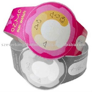
Health: "Sun Watch" changes colour and illustrate needs when exposed to the sun.
Structure: Christoph Klemmt's award winning Or2 Photochromic Canopy Structure.
Paper: Advertising for skin cancer.
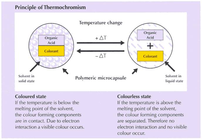
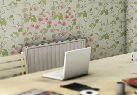
Which then brought me to Thermochromatic Ink. Instead of light affecting the chemical structure, this relies on temperature.
Architerials has a great look at Thermochromatics and its use.
Film:
Polyester:
Click on pics to go the links and information.
Labels:
Concept,
Design,
Info-design,
Materials,
Rant,
Technology,
Textiles,
User Interface,
Walls
Subscribe to:
Posts (Atom)