Hello!
Its been a while. Today I thought I would boast a bit about Ash West. We both have been trying to get our feet shoved firmly in the hypothetical designer door. On more than ten occasions Ive decided to give up design and jump into clown college or marry rich. But that is a whole other commitment issue Im happy to avoid.
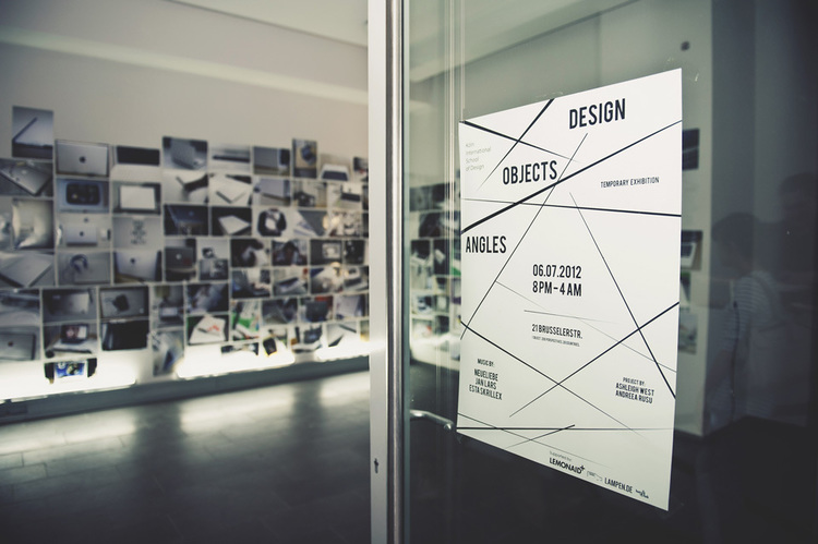
Anyway. She is focused on embracing "user experience design, visual communication, design strategy and content strategy. This is with a focus on creating human-centred design solutions." With a fair bit of travelling under her belt, and a conceptual brain to boot, her works are always layered with insight and expressions of her own design style.
Head over to her site: hello-ashleigh and have a squiz at her portfolio.
Showing posts with label Concept. Show all posts
Wednesday, 30 April 2014
Bit of Boasting
Labels:
Ashleigh West,
Concept,
Design,
Graphics,
Info-design,
Photography,
User Interface
Friday, 29 November 2013
Smokos Without the Smoke
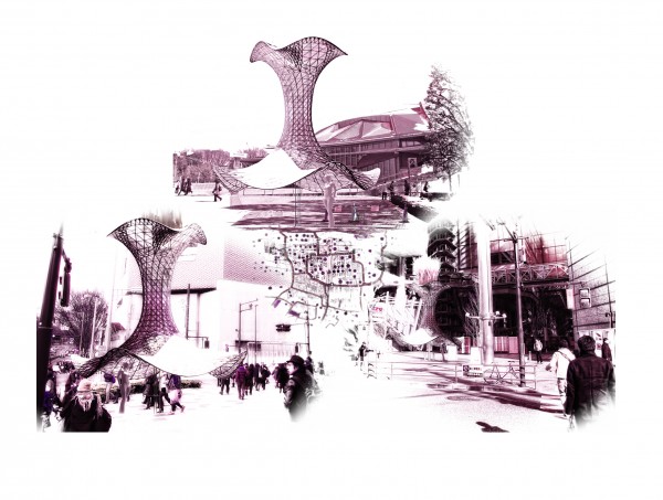
Perpetuum Mobile is a reason to get some fresh air. Developed by O+R the outdoor funnels facilitate smokers and non-smokers to share the air.
As an allergy-prone-belong-in-a-bubble type of person I am all for this. At the moment it is envisioned for Tokyo city, but if it wants to settle in Sydney, I'm all for it. More info at evolo.
Labels:
3D Modelling,
Architecture,
Concept,
Design,
Star-trekky,
Technology
Friday, 7 June 2013
Update!
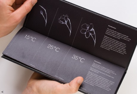
Along with the paintings, I'm making a pamphlet & business card. And possibly website (for the future considerations category in the marking guide...I think there is one). These are some spreads and cover ideas for the pamphlet. The cover will have black disappearing paint on the cover with orange stitching up the spine. Once people touch the pamphlet it will disappear showing a print under it. As of this moment, it will be the orange finger prints to reflect ergonomics and how people actually hold it.
These pics show how I hold the pamphlet and position the prints.
After questioning many many people about it, the handprint option is a winner.
Labels:
Concept,
Design,
Graphics,
Illustrator,
InDesign,
Info-design,
Photography,
Photoshop,
User Interface
Saturday, 11 May 2013
Open Brain Storming
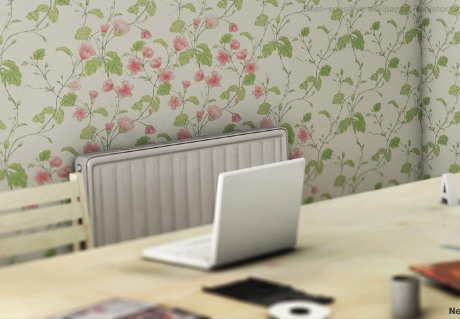
After researching photochromic and thermochromatic paints and their uses I've been thinking about the final presentation...Not long now. And I want to present something other than printed materials. I came across these handmade wall decals on facebook a while back. Just a bit of corn starch or a pre-made stick and boom instant wall art or wallpaper.
pistachioproject, sewingforscarlett & curbly have some good tutorials.
While I wouldnt be allowed to paint a wall at cofa, perhaps I could stick it on and peel it off.
Crazy walls crazy walls crazy walls
Photochromatic Stuff
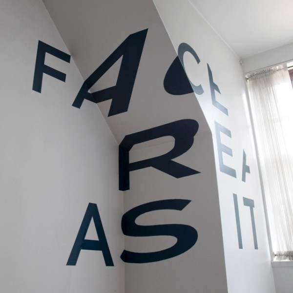
The museum goudA redesigned their torture chamber using UV. Illustration - Jos Verwer, and Type - Trapped in Suburbia
pistachioproject, sewingforscarlett & curbly have some good tutorials.
While I wouldnt be allowed to paint a wall at cofa, perhaps I could stick it on and peel it off.
Crazy walls crazy walls crazy walls
The museum goudA redesigned their torture chamber using UV. Illustration - Jos Verwer, and Type - Trapped in Suburbia
Internal Philips Design Metamorphosis document. The bookcover uses photochromic and thermochromic ink.
Calignosity by Andreas Pohancenik - UV Varnish and invisible UV ink screen print on ebony plike, A1
Labels:
Concept,
Design,
Illustrator,
InDesign,
Info-design,
Ink,
Product,
Technology,
Textiles,
User Interface,
Walls
Photochromic & Thermochromatics
So the last couple ideas were not working out. They were catering towards the tutors' specialties and not necessarily as a combination of my majors: Graphics Media and Environmental/Spatial Design. I wasn't however processing the feedback correctly, even if Richard's was "make it".
Now. I've been looking at lights:
Anthony McCall, "Five Minutes of Pure Sculpture" & United Visual Artists, "Vanishing Points"
Other things:
Jody Xiong, "Green Sidewalk Campaign" & Adam Niklewicz, "The Charter Oak"
And Brad, in our thursday class, discussed going back to graphics in the environment using UV paint that reacts to blue light. Tunnel vision had set in and I hadn't analysed my process from an outside perspective. I had become to accustomed to Katherine Moline's graphics class, where sets of tables or the entire class would go round to each persons' work and give feedback. Now there are too many students per class, and not enough time to talk with tutors. That and my own tunnel vision.
Now that all this has been understood, I am adjusting my thinking back to graphics-y things (so i can still use a bunch of research including info-graphics!). Photochromic inks change colour when exposed to ultraviolet light from the sun or a black light. Examples:
Clothing: Printed shirt alters colour in the sun.
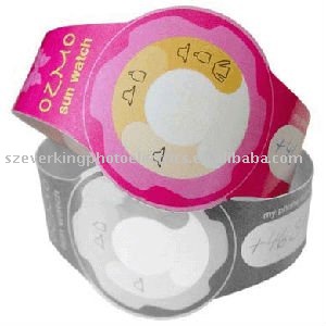
Health: "Sun Watch" changes colour and illustrate needs when exposed to the sun.
Structure: Christoph Klemmt's award winning Or2 Photochromic Canopy Structure.
Paper: Advertising for skin cancer.
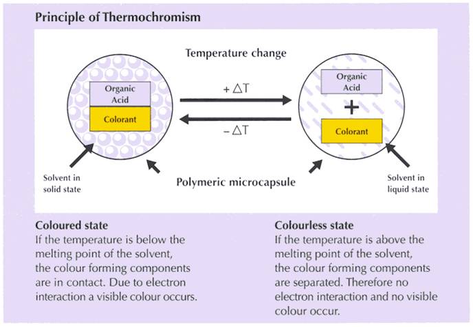
Which then brought me to Thermochromatic Ink. Instead of light affecting the chemical structure, this relies on temperature.
Architerials has a great look at Thermochromatics and its use.
Film:
Polyester:
Click on pics to go the links and information.
Labels:
Concept,
Design,
Info-design,
Materials,
Rant,
Technology,
Textiles,
User Interface,
Walls
Wednesday, 24 April 2013
Back Again!
So huge delay since I last posted. I'm lazy. And sick. Mostly over a cold now. How lame. But I am relishing my mid-semester week off!
Anyway, last week Brad turned me towards a mix of biology and technology in design and art. Natalie Jeremijenko is a "design engineer and technoartist" now based in USA. She is super talented and an all-around genius with awards and commissions and features. More info here: fondation-langlois.org.
Allan Giddy was another mentioned more specified towards sustainable energy systems. Part of COFA school of art staff (cofa.unsw.edu.au) he directs the ERIA (The Environmental Research Initiative for Art) at COFA, an "organisation aimed at reinvigorating decaying public spaces through the installation of "active" artwork".
And lastly, James turned me towards social experiments including Studio Moniker's "Do Not Touch" interactive video. Ta Da:http://donottouch.org/. Have a go! Its strangely addictive. Like 'pong' or 'pacman' or 'tetris'. (Are these still around?)
Anyway, last week Brad turned me towards a mix of biology and technology in design and art. Natalie Jeremijenko is a "design engineer and technoartist" now based in USA. She is super talented and an all-around genius with awards and commissions and features. More info here: fondation-langlois.org.
Allan Giddy was another mentioned more specified towards sustainable energy systems. Part of COFA school of art staff (cofa.unsw.edu.au) he directs the ERIA (The Environmental Research Initiative for Art) at COFA, an "organisation aimed at reinvigorating decaying public spaces through the installation of "active" artwork".
And lastly, James turned me towards social experiments including Studio Moniker's "Do Not Touch" interactive video. Ta Da:http://donottouch.org/. Have a go! Its strangely addictive. Like 'pong' or 'pacman' or 'tetris'. (Are these still around?)
While I had seen this particular game before meeting James, I felt slightly narrow-minded or more-so narrow-sighted in identifying the process as a designed element. Perhaps being so focused in 3rd year on a particular niche, I havent exercised my thinking too much. Maybe I just have slacked off and have shut off the part of thinking that allows experimentation in outside design elements to be considered. Does that make sense? Probably not. On the other hand it may have been the way the university has been conditioned to teach. Im not saying or trying to imply that COFA teaches in an archaic way...at all. I feel that teaching has not developed as far as I believed it should have. Do we rely on principles that have not evolved to the level we should demand of it? Its always been understood (in my mind at least) that university study is a more personal, independent-driven level of learning. So why does it still revolve around high school systems? The courses themselves are designed to expand your knowledge on a particular subject you are aiming to pursue in future. They are tailored to inspire, educate, contemplate, drive...If they develop people and their thinking, why is the idea of obtaining optimum marks such a high consideration? Shouldn't the focus be on your ever evolving sense of self and design philosophies and personal growth within said subject? Waaaaay off topic.
Ive been researching the idea of social experiments, particularly frog and TouchTunes' Crowd Sourced DJ'ing at South by South West (SXSW). core77 - has a blog outlining the process of generating and realising this project. Its pretty damn interesting.
It got me thinking of the Sony Bravia ad. What I would give to let this happen at COFA or UNSW campuses! Screw safety. I want to be emersed in colourful bouncy balls. Perhaps we should stick them to the grey concrete encasing the cofa campus.
Back to the project. The more I look into social experimentation, it develops a stronger tie to the project I am undertaking. Last week I was stuck on the idea of "melting walls". It was really bugging me. Somehow melted cheese was stuck in my head (which is odd, because I hate cheese). Its not necessarily the direction I want to take, but I would like to know the Why behind its consistent reappearance. Perhaps its just the aesthetic I find appealing, or maybe im just too damn narrow in my thoughts.
So. Next step: research (yay) into tech and social experiment (and how to display and integrate this information). Oh yeah, presentations coming up on thursday. Its gonna be interesting: Richard and Karina are "judging"...High school all over again. Maybe I should re-direct and element within my project to question and develop ideals of education. Too late to start a new project? Maybe i'll keep that on the back burner.
DFTBA
Labels:
Advertising,
Concept,
Design,
Film,
Instinct,
Rant,
Technology,
User Interface
Friday, 12 April 2013
Ground Control
Trekked it into the Glue Studio today to have a chat with James Dive! It was really interesting getting information from a practicing creator outside of uni. And I spent more time talking about my project with one stranger, than the combined time spent with both tutors over the last 5 weeks (giant class sizes are to blame). I now know what it feels like being a tween-girl watching twilight....What a dork. Next stage is compressing the ridiculously long brief cofa assigned and busting out some more research.
Dive mentioned Storm Glasses that "detected"...storms. There were sealed containers with distilled water and chemicals. (This was thought of due to the narrowed down idea of "creating atmospheres to demonstrate energy usage" and responsive objects/installations).
And now some new designs:
Storm Glass, Craig Borum, 2011
Tempo Drop, Perrocaliente
Scientists still don't understand exactly the way it works, however theories include temperature changes, electromagnetic changes and particles quantum tunnelling through the glass. They're a great example of objects that react to the environment which is kinda cool.
Nasa releases time lapse videos every now and then and proves just how insignificant we all are. It brings into sharp contrast our inflated opinions of the human race (just because we have opposable thumbs). That and atmosphere.
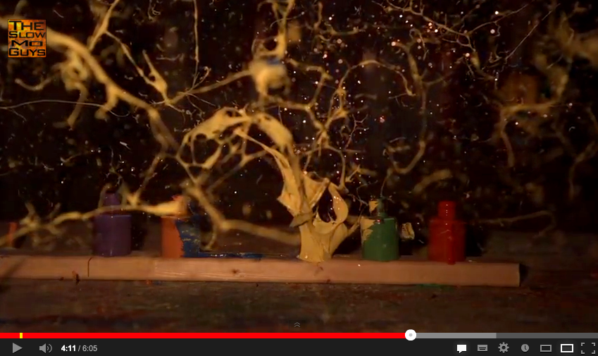
And then the slow-mo guys uploaded a video of paint exploding at 15000fps! Once paused the images give the same impression. Now imagine that as an object! A bit off track but scale it up a bit and have the lights pulse BOOM!
atmosphere atmosphere atmosphere atmosphere atmosphere atmosphere atmosphere atmosphere atmosphere
Labels:
Concept,
Design,
Film,
Info-design,
Product,
Space,
The Glue Society
Subscribe to:
Posts (Atom)