Showing posts with label Energy Aware. Show all posts

Friday, 31 May 2013

Last Few Weeks

There are only a few weeks left until this project is finally over. There are a few developments, a few set backs and just general work needing to be done. 
Here is some more stuff. I've been jumping back and forth for the final designs in thermo/acrylic paint. The categories i've narrowed the ideas into include: photo, abstract, metaphor, icon and pattern. 
As the pigments of the thermo-dyes are powdered I went to the local art shop North Shore Art Supplies and bought a $30 bottle of clear medium to mix it. Hope it works well. As i still dont have the dye, and probably wont until the 13th, ive been working on how to display and make the prototype. The local $2shop is having a 40% off sale (YAY), so im going to run up to grab some large frames. On sunday im in the city helping a friend with prop design, so ill run up to Recycled Garbage too and find something great to print/paint on. Im having difficulty deciding what to print on as it needs to be heat proof and also be able to be touched repeatedly without getting ruined. So some solutions include:
- printed paper/board/card with a plastic overlay
- printed paper/board/card with a glass overlay (frame)
- printed plastic/glass

The heating element has been a bit of a head-scratcher. I was torn between using arduino to control it, but ended up ripping up an electric heating sheet. Which was not fun. Also - RE-USE!
This Sunbeam Electric Blanket was made in New Zealand with 100% Polyester. Its 250volts~1amp~100watts. The PVC plastic used in the wiring & control components is a polyvinyl chloride plastic which is used in everything from pipes, shower curtains, plastic outdoor furniture and childrens' toys. It can be recycled and re-used however it takes a crapload of time and effort to reduce it down and have it degrade. I did have to test is, as i didnt know if it still worked. It does. And heats up so damn quick.

The next couple things I need to do (start, end, middle):
- Designs & individual names
- Name the series
- Visual Identity
- Final product (life cycle analysis - materials & processes)
- Postcard type material to reflect important info for presentation
- Render vids/pics
- Timelapse vid (borrowing a friends' camera and expertise...bribe with candy)
- Possible shopping website 
- Presentation visuals(pdf) & general speeching things


Sunday, 5 May 2013

Weather

The sun is pretty much king of the power cycle. Hank Green from SciShow (also happens to run ecogeek) discusses the sun. Aside from affecting the melanin in your skin it also makes for a great energy source. However we continue to screw everything up with economics. Watch.

The reason I am bringing these ideas up is due to the fact that core77 had a great blog posting about Solar Panels in Rural Uganda by An Xiao Mina. I suggest you, after watching the above video, is go to the link and have a read. 
Mina looks at rural northern Uganda and their power needs and how they achieve these and problems facing these results and stuff. These posts are part of an ongoing series responding to Tricia Wang's series of posts. Ah, infinite cycles. 

The next thing! Dry Drizzle Rain Room! atmosphereatmosphereatmosphere
This is part of MoMA PS1's EXPO 1: New York exhibition. It is "a large-scale festival exploring ecological challenges". The installation is a 100square metre space of falling water. Yes, indoor rain. It responds to your movements and "presence" and lets you walk through it without getting wet. It was created by rAndom international. 
If it was me, I would program the installation to "act up" every now and then. JUST BECAUSE I COULD. So why am I showing you this? Other than its pure awesomeness, it relies on a sense of atmosphere. And they do this through weather....Or abstract weather. The idea of weather. Not only is the actual project beautiful, the media surrounding it is poetic and strangely similar to concept design. 
Turns out the project was found here, a blog written by Vincent Di Maggio. He has a better engaging style of writing and better knowledge. But he didnt have a video to link. So both blogs get referenced. The only thing I have to question is the sustainability factor....Where is this rain obtained from? Where is it going? How about the values and materials used? Nevertheless, I want to go and experience it.


Saturday, 4 May 2013

Whoops

The last post was a bit of an overreaction. A massive overreaction. The kind of reaction you get when you put a mentos into a coke bottle. Turns out I had Richard and Karina. And I scared the crap out of them with my research and enthusiasm. I was feeling a little lack-luster after so I took a day and jumped onto evolo and found some random inspiration. 


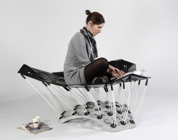
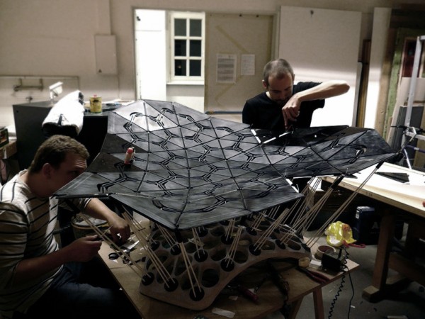
ChairBedStool
Design & Construction by Thoman Hiemann and Markus Dilger
Creates in the project group ID5, UdK Berlin with Prof. Burkhard Schmitz (no relation) and Katina Sostmann. 
I think, from the evolo page, that it was about "permanent adaption of the surface to the human body." By itself, the object looks like a reincarnated medieval torture device, due to its plastic clusters and elastic rods and geometric patterning and rigid segments and whatnot. BUT IT IS FREAKING AWESOME. It reacts to body movement and alters perceptions (or at least my perceptions) of static or stationary furniture. 
Im not entirely sure why this project is so interesting. Its a bit star-trekky. I want to see it in a long expansive structure. Adult trampoline.


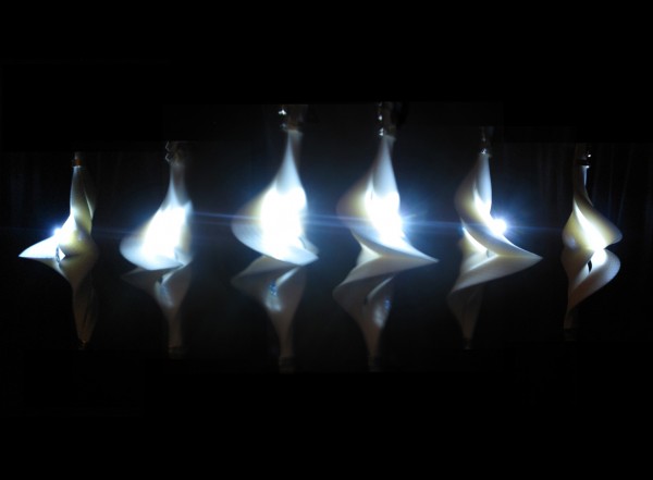
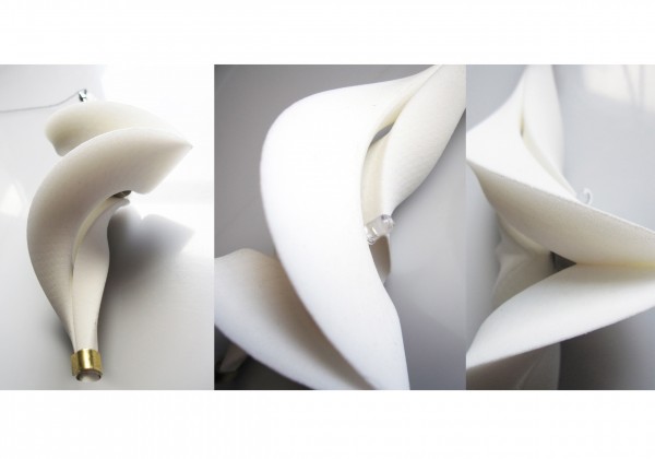
Designed by Dr. Margot Krasojević, the 3D printed nylon polymer lamp is suspended by a spindle. Its weight and form dictate the momentum as it spins which is affected by minor environmental change eg temp and current, all which change light patterns. Then there are some rather interesting words which talk about technology and physics. What I can decipher is that the light has been influenced by the physics behind ice skaters and spinning tops.
I think they are so interesting due to their convergence over a number of disciplines. To me they could represent energy efficiency, organic structure systems, dance, sea life, new forms of technologies, the combination of physics and design for interiors, art, etc etc. Maybe its ambiguity is what is intriguing to me. Without information on the product and no real conventions to rely on, its hardly a known object. Yep. It could be anything. I like that idea most of all.


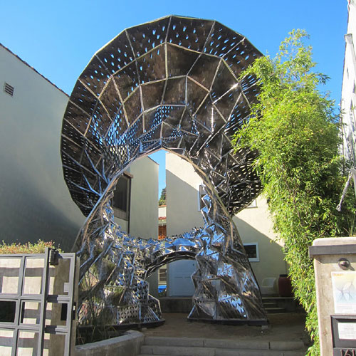
USC architect Prof. Doris Kim Sung design this "Bloom" installation made of 14,000 pieces of thermobimetal. That is, two thin sheets of metal with different expansion rates laminated together. The metal reacts to temperature with a direct correlation to the sun. I dont find the structure nearly as impressive as the technology itself. Metal that moves. Paradox!


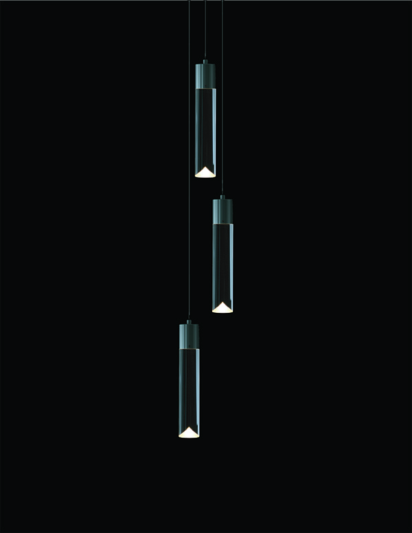
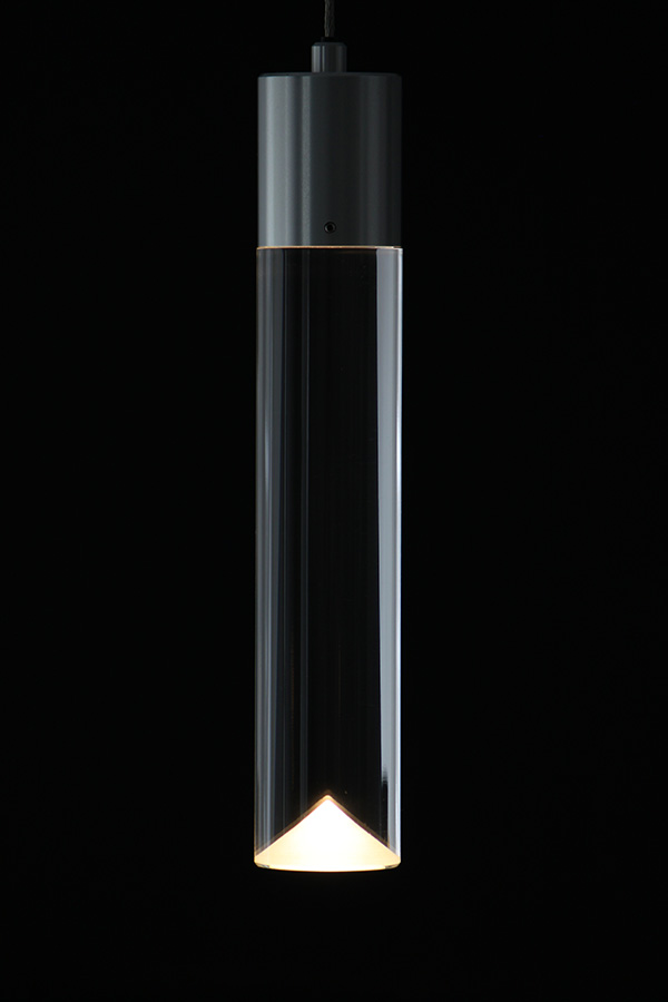
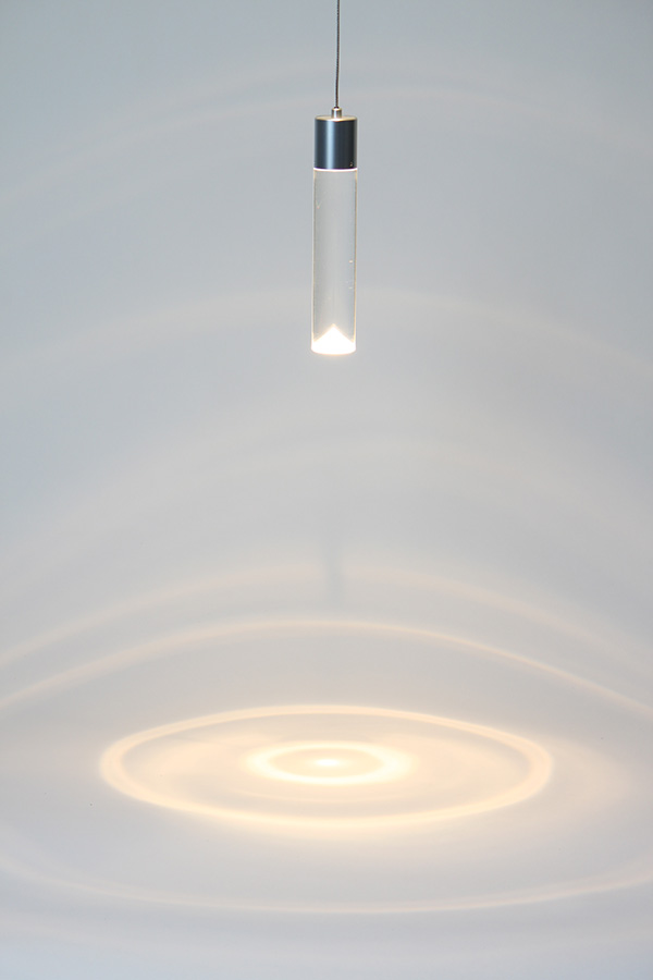
Saleem Khattak designed this energy efficient LED lighting, a luminaire that evokes the best qualities of incandescent lights: warmth, comfort and intimacy. Diffusers and cylindrical casing stops the glare from a visible light source. This is a perfect example of subtle complexity pwning overtly complex systems. I WANT ONE. Or a bunch. Put me down for a bunch. They have invert candle like qualities, in LED form.


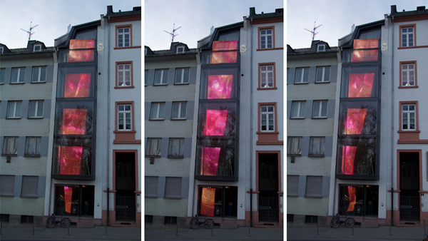
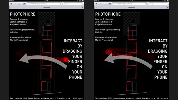
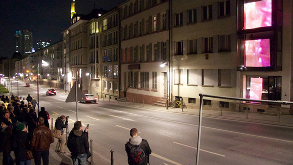
A 3D responsive veil operated by a smart phone. Designed for the Luminale 2012 in Germany, Kollision installation is a 5 story veil of light. People are able to scan those stupid QR codes into their phones and swipe the installation to the side. Jochen Schroder & Katja Winkelmann who planned the project along with Martin Professional (hardware & installation) and Kollision who developed the interaction & programmed the interactive player. They used photoshop software built in C++ and Cinder library to create the real-time 3D responsive wall. A website was built to assist the interaction.


I really like works that invite the audience to participate, engage and direct the result in some way. They provide a realisation of the audiences' affect on design and prove that the works are acknowledged on various levels of understanding. 

Sunday, 24 March 2013

Mike Thompson

Mike Thompson, a U.S artist created a vamp lamp whereby you break the glass topper and bleed into the solution to power it. 


Titled "Blood Lamp," the 2009 project is accompanied by this creepy vid. This is the quote Thompson posted underneath his video:

"What if power came at a cost to the individual?
The average American consumes 3383kwh of energy per year. That’s equivalent to leaving the light on in 4 rooms for a whole year. The simple flick of a switch allows us to power appliances and gadgets 24/7 without a thought to where it comes from and the cost to the environment.
For the lamp to work one breaks the top off, dissolves the tablet, and uses their own blood to power a simple light. By creating a lamp that can only be used once, the user must consider when light is needed the most, forcing them to rethink how wasteful they are with energy, and how precious it is."
So its a bit of a literal interpretation of what I'm proposing to design.


Monday, 18 March 2013

Notebook

People have a skewed view of the creative types - particularly their writing and notebooks/journals/diaries/folders etc. Well are some pages from mine.


So as you can see, my writing changes with my moods. Its all a bit messy, a bit scribbly, a bit...bitty. 

I thought I should type out some notes (and descriptions of the rather hurried sketches), most have already been covered though:
- messing around with what kind of deliverables/concepts - future technology map/product,  visual design map/patterns/visuals etc
- sketches of the technology map layout
- how do I make the tech products environmentally sustainable/fixable/personalis-able, low energy use?
- need to develop a metaphor - and conceptual models for next week!
- what would I apply the metaphor to?
- how do we get more people informed of their energy use?
- how can we put it in a wider context?
- how can the information be visually engaging?
- how can the information be clear and not frustrating/confusing?
- how can we identify where energy is being used most?


So i've been seriously questioning whether i'm hitting this problem at the end of the cycle, not at the beginning? So I knocked up a couple images reflecting a energy cycle (left page). So people affect every part of this cycle. Only the target market I propose to isolate is students (my tutor suggested narrowing the market early - to make the brief a bit more specified). 


People affect every stage of the cycle. [Hit up Leyla Acaroglu for more about life cycle analysis! She makes for a really interesting lecture.] We dig up the fuel, process it, transport it, manufacture it, create everything that it depends on and have a hard time living without it. So if we affect every stage of energy, how have people let it get so far? 

I guess I am attacking the last-ish part of the cycle: the people (students) in their homes. Most of us are pretty ignorant when it comes to understanding the effects of the energy we use. They do say however that education is the first step: so lets begin the education. 

"Director of Carbon Arts, Jodi Newcombe believes that energy is "out of sight, out of mind, which is probably why we waste so much of it." Newcombe comments on other visual displays of energy suggesting that such "strategies work in managing consumer demand because consumers are more likely to act on a subtle but always present message." (Tan, Sun-Li, 2012)" - this was taken from the "Background" page of my brief. 

Maybe enlightening people from the comfort of their own home and re-training priorities of Cost, turning them to Climate Change will alter public perceptions of resource usage.

Saturday, 16 March 2013

Monitoring..Some more.

Im going to bash through a bunch of stuff real quick!

thegreenergrass has posted a couple great ideas when it comes to understanding power:

Power Conscience concept by Delroy Dennisur

The Home Joule by Ambient

EDF Energy Saving Adaptor

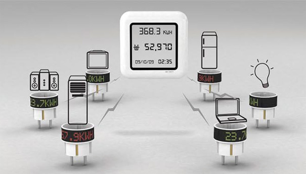
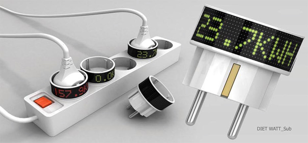
The Diet Watt System: yankodesign 


Now. It seems a little stupid to use energy to show energy usage. But how else are we to?

Glo Nightlight

Glo Nightlights are marketed for kids. However I want one. Still with the concept of tangible/visual energy, these lights are exact representations of the idea. They change colour and have a goofy low-energy LED base with 9 volt power adapter. The balls glow for 30mins off the charger and dont have electronics in them...so perfectly safe for children. How they work, I still have no idea.
You can buy it here: booninc


This guy, David Di Franco, has a fun vid about unpacking and trying out the Glo Nightlight. And good on him for buying a kid's lamp. 


Thursday, 14 March 2013

The Future of Solar

Visual.ly specialises in info-design. They knock up great displays on their site: visual.ly

This image was developed by GE and JESS3 to reflect solar power. Data visualisation or infographics help "detail the complex story of solar power and provides additional concext for GE's lastest product in solar technology..."
Its a nifty little pic that demonstrates where the company sees its future by reflecting on its past.


The Future of Solar Energy

More videos....

Yep. More flicks about energy!

This is a great little movie about "Deploying Home Energy Management Agents" from the Aladdin project. Focusing on energy use in England, the illustrative movie looks at COST more than anything. 


Unfortunately it wont let me embed it. So you're just going to have to click the link : Deploying Home Energy Management Agents


The Energy Literacy Platform looks at the conservation of household electricity. 
"With the Energy Literacy Platform we offer, users can learn about the amount of electricity they are consuming every day in a more intuitive wat and increase their home energy literacy. Through this our goal is to reduce wasteful electricity usage and promote more efficient home energy consumption."


The system utilises in-home 'plugs', websites and applications to combine the most effective platform current technology is able to provide. 


Energy Rehab is another energy saving concept using STICKERS! Of all things! A little concept vid with oversized bills, tiny european apartments, and borrowing money from siblings, the 'sticker' concept uses future technology. How this is achieved, I have no idea. I have a hard enough time keeping my travel10 bus ticket, so this card would have a rough time in my house. 


Im out!

Saturday, 2 March 2013

Inspiration Point

The guys from Oglivy and Mather were hired by HSBC in India to develop a campaign for global warming. This was a pic I used for the first week "inspiring imagery" tute. Its pretty damn cool (no pun intended). 
So do I hit up the advertising route and subject myself to the pain and suffering of trying to find an angle that hasnt yet been hit? Changed my mind. I want to be a clown.   

In-Home Displays

GEO - Green Energy Options, a european company has jumped on the 'smart home' bandwagon and utilises home displays, smart plugs, CT clips and LED readers. As close to universal functioning of a home, GEO provides "easy and intelligent management of electricity, water, gas, heat, boilers and microgeneration" with an option for solar as well. While the idea isn't exactly new, it seems to be the most comprehensive stand alone system. 
All the gizmos look fancy-pants with an iron-man displays and cutesy pics. Im sure once you become familiarised with the info-design it becomes less of a clusterfuck. Its small, very detailed, touchy screen, and just a bit lame. Im all for gadgetry. But good god, I have a tough enough time with my phone, so how am I supposed to be expected to use this thingamabob?


Things that bug me about these: 
- lack of context of the wider problem eg global warming, non-renewable resources etc
- some only cover one resource at a time
- information is unappealing and hard to understand
- the information is only relevant overall and not for separate outlets
- it is not immediate in the way that the information is not smack-you-in-the-face in every room. You need to either look at this gadget or go online. 

[These reviews were only in reference to my project. Please dont get all touchy-feely about it. I think they are very snazzy gadgets.]

Is this the direction I want to take my project? User interactive systems within a house?


http://www.greenenergyoptions.co.uk/what-we-do/products/

Low Tech

This is a low tech idea making people aware of their energy output. Basically a "smart board" monitors the electricity usage and the numbers are written on GIANT blackboards hung on their balcony. 


The guys, sorry Doctors, at the Uni of Sydney knocked up this idea and had it going for a couple months. Subtly titled: "Comparative Feedback in the Street: Exposing Residential Energy Consumption on House Facades," (smooth) the project "studied the energy consumption of 11 households in Darlington, Sydney, in November 2010." 

There were graphs and frowny faces and colour and rankings. Electricity: THE GAME! So going back to game theory - it utilises important issues and changed the way the residents viewed their usage by essentially turning it into a competition. Yay team! 


http://sydney.edu.au/news/84.html?newsstoryid=8001

Mindmapping

Mindmapping - very keen with the mindmapping. Should have posted this straight off. Using MindNode from the app store. Kinda great. Pretty straight forward. 


Videos

Along the same kinda lines of the Energy Aware Clock, this "reflOw" is a concept designed to make people aware of energy waste. Kinda star-treky. Trekky? Whatever. They busted out some illustrator techniques to demonstrate electricity usage, which reminds me of multi-coloured tadpoles. Have a watch.

reflOw from TRX on Vimeo.

The link refers to "reflOw" as being a "visual guide" that "shows the instantaneous rate of used energy". So bang on topic. Essentially these guys took a video of their place and overlayed the visuals pretty damn effectively. Its an abstract interpretation of info-design and aesthetically inspired. The link doesnt go into details about how this would be technically possibly, which as a tech head is disappointing. Eh. Its a cute concept. I have a feeling I would just make some popcorn and turn things on to watch "reflOw", wasting more energy. And if they could illustrate cartoon characters running around yelling at people to turn of powerpoints, that would make my day. 

Researching

I stumbled across the Visual Voltage Exhibition online looking for "tangible energy" or "visualising energy" (some crap like that). According to Design Boom the exhibition "explores the use of energy through smart design..." and for more info the link is below. 

Anyway this is an Energy Aware clock. Yep. The irony isn't lost. But its a great look at the crossover between art/design/technology/info-design..blah blah


The simple design, straightforward concept and ease-of-use all combine in a gooey brownie mix of elegance and just enough sci-fi-y characteristics to make everyone want one. It hits a 24 hour time scale and aims to configure the smallest energy-use-picture. Its a brilliant idea/product. Well at least to an extent. My concept follows the same lines....only at a bigger scale. It shares a pictorial expression of what is being measured and has an in-home local. tech tech tech tech.

What else...Its limited. Bit uninformative. Too simple. Exactly what it was supposed to be.
Lets pimp it up.

http://www.designboom.com/design/visual-voltage-exhibition-at-design-vlaanderen-brussels/

Fourth Year Cofa Project


This begins the new, FINAL, year at the College of Fine Arts. Before it had even started we were bombarded with emails from the course coordinator with info on the project. Essentially: You will be in pain and suffering from the get-go. So we buggered around the first week presenting initial concepts with a couple images, getting to know the tutors and wondering who at least half of the class were. 

So after a couple weeks of half-assed researching and concept development we are to rock up on Monday with whatever we have, ready to dive into these projects. Unlike previous years work, all ideas seem week. Though they retain a conceptual basis, I think our ideas seem lackluster for the importance of the project's aim: Get us a job in our chosen fields. (Though they say it'll take at least 2-3 years of interning and crap conditions before we even get minimum wage). 

Really, I want to get into animating virtual environments and VFX using CAD. After years of plain old design in Graphics & Environmental/Spatial Design my affinity for computational creativity is my best and preferred way-to-go. Yes, huge nerd. So essentially I want to knock up some sort of 3D modelling. 

However I am currently going round in circles for a couple reasons:
A: I have tutor Richard Goodwin. Architectural genius. Knocking up buildings or structures with any kind of integrity seems highly unlikely, specially as I am definitely not an architect. 
B: Even if I did do some modelling, the project timelines COFA kids get are seriously lacking for rendering time.
C: Are other ideas only shadowed because I enjoy modelling far more and therefore are there other concepts/ideas I am avoiding that could be potentially better?

At the moment the concept is to smack people in the face with visual data to reflect a larger context of their energy/waste/water usage. I figure if its unavoidable, it will sink into subconscious and eventually become commonplace. Instead of widescale advertising campaigns, perhaps bringing visually enticing information into peoples houses/workspaces and providing a wider context for people to understand their actions.

Anyway. Done. Stayed tuned for research.